This is a guest post from Lonely Few’s Rod Green. Go to https://blendoku.com to grab this game — it’s free — for iOS or Android.
Colorblindness affects a large number of people and to varying degrees and we got a LOT of people saying “Blendoku is a great game but sucks if your colorblind”.
We initially got kind of annoyed at this because we felt it was kind of obvious that the game wouldn’t be suited for people with colorblindness. Or at least they wouldn’t be able to play all levels. The game is designed in a way where you can play at the level if difficulty you enjoy. We don’t gate or progress block the player, if you are having troubles or flat out can’t play a level then you can just skip it.
After a while this colorblind problem started to bug me. How could we make a game that primarily focused on distinguishing color support people who are colorblind? I mean wouldn’t that just totally break the game? Think of it like Sudoku; what if you couldn’t count past 7? Not that you aren’t intelligent enough — it’s just that 8s, 9s and 10s all look like 7s to you.
How do you ‘fix’ Sudoku to support these ‘numberblind’ people?
We ruled out any form of substitution, i.e. replace the colors for shapes. This sounds logical enough but since we’re dealing with colors there’s potentially more than 16 million colors we’d need to represent. So any shape language would be too subtle and too complicated to comprehend for most people.
We thought about just adjusting the ‘problem’ colors but this would break some levels that already have similar colors. As they would create blends that are too difficult to solve. Also in practice almost all colors could be considered a ‘problem’ colors. As I mentioned earlier colorblindness affects people to varying degrees. Also not all people who are colorblind are the same ‘kind’ of colorblind. In fact there are three main types of colorblindness though red-green colorblindness is far more common.
What we settled on could be best described as a hue shift system. Basically we allow the user to shift all the colors in a level along the color spectrum evenly. This means that the overall integrity of the puzzle is maintained and the user can decide how much of a shift will work for them.
Why specifically 6 steps?
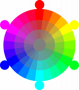
The color blending we used was based on Red, Green and Blue or RGB color wheel. If you break that down to the in-between colors you get Red, Yellow, Green, Cyan, Blue, Magenta or RYGCBM. So as you can see there are 6 distinct colors in that color wheel.
We tried doing more than 6 steps, but the change was mostly too subtle to really offer any distinguishing difference. So that all seemed pretty straight forward except that we noticed if we hue shifted the baked blends then we wouldn’t get very good results. Due to the lossy nature of how we were shifting the colors some blends wouldn’t look right after they were shifted. So we decided to shift the keyed colors and recalculate the blends for all 6 steps in each level. So in realty there’s actually 6 level variations per level we’ve created. Though it was necessary this also meant we had to save more data (6 times as much) into the levels.
What about puzzles with a lot of key (or known) colors?
So the solution we’ve created is pretty robust, but there could still be cases where you’re unable to distinguish all the colors in a level regardless of how much you color shift. We figure that in these cases, typically master levels, you could just solve part of the level then shift to solve another part. This is how most people typically play the game in any case so we don’t feel it’s a huge compromise to the fun of the game. So while our solution isn’t perfect it does go a long way to making our game colorblind supported. If we can do it in a game that’s all about colors then I’m sure other developers shouldn’t have any trouble adding support for colorblind people.

