
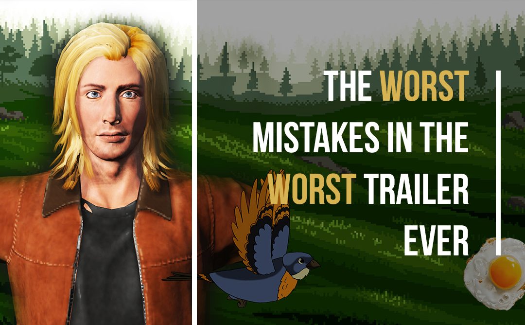
If you ask me how I feel about German sausages, I would tell you that they are the wurst. Coincidentally that’s the same answer I’d give if you ask me how I feel about the following mistakes and the trailer we made when we put all of them together. Here’s the trailer (I’m sorry);
Big Mistake No. 1 – Logo intros (0:00 – 0:30).
Please don’t do this. I know some of them are shiny but they aren’t telling anyone about the game and these are the most important and effective seconds of the whole trailer. Unless a studio is at a level where gamers are waiting with baited breath to see what they do next, don’t include the studio logo. Same goes for publisher logos and any of the tech used in the game – people are very unlikely to care and you’ll lose a sizeable chunk of your viewers from the onset.
Big Mistake No. 2 – Pretentious Developer Interviews (0:30 – 0:43).
This is the worst. Yes, you worked hard on this game and it’s your life, but to everyone else it’s just a video game, so don’t take yourself too seriously. Gamers want to see the game; they don’t want to see a developer in a bright-white-room talk about the journey they’ve been on and how s/he feels about the game’s ethos. If you really must be on camera somewhere and your community definitely cares enough about the team behind the game then by all means create some behind-the-scenes side content, dev-diaries, etc. just leave it out of the trailer.
Big Mistake No. 3 – Disgusting non-unified fonts (0:30 – 2:17).
Ok, this is actually the worst. Admittedly, we’ve gone a bit extreme here, and the various fonts and colors in this trailer have made people at Evolve physically sick, but it is really important to get it right. Viewers will judge your game based on the expertise with which it’s presented. If you are going to have text-on-screen, talk to a graphic designer, even if it’s just a friend (we all have that friend on Facebook who is good with Photoshop) and ask them to arrange the text for you, you won’t regret it.
Big Mistake No. 4 – Going too big with your concept (0:45 – 0:57).
It’s scary putting out a game that you’ve spent years working on, crossing your fingers hoping people notice it, but don’t let this fear push you to make your game seem like it’s bigger than it is. If you preface your trailer with epic sounding statements about how it’s going to revolutionise the genre, you are likely to disappoint when people see your game.
Big Mistake No. 5 – ??? (0:57 – 1:06).
I’m not even sure what the mistake is here, it’s just really bad. Please don’t try this at home.
Big Mistake No. 6 – Listing boring features (1:06 – 1:27).
You know when I said the other mistakes were the worst? I was lying, this is the worst. You and your team have made all the levels, hand-drawn every character and tweaked every weapon, so for you it feels like telling people just how much work has gone into the game is important, but it isn’t. “I really fancy playing a 6-level game with 10+ characters tonight, let me check Steam” – said no one, ever.
Big Mistake No. 7 – Not showing gameplay (1:27 – 1:44).
HOLD UP! Worst mistake right here! Why hold off showing the one thing that gamers have clicked to see, you need to get it upfront as soon as possible otherwise viewers will click through the timeline two or three times and if they don’t find what they are looking for will click away.
Big Mistake No. 8, 9, 10, 11… (1:44 – 2:01).
Ok this is a mess, bad bad bad all-round. Key take-homes from this section boys & girls; make sure you show variety in gameplay, don’t spoil the ending of the game (obviously) and try to make an actually good looking game unlike the catastrophe that I whacked together in After Effects.
Big Mistake No. 12 – Bad graphics (2:01 – 2:11).
If you can’t create good graphics then leave them out. Similar to fonts, shoddy graphics, transitions or animated text will lead viewers to assume that the game’s graphics will follow suit. Some simple, elegant text on a black screen will have way more impact and keep the quality-feel level higher than if you 3D ball-bounce your text onto some gameplay.
Big Mistake No. 13 – Game Name Shame (2:11 – 2:14).
This isn’t really anything to do with the trailer and should be sorted out looooong before you put out any videos, but definitely don’t make it this long and stay away from the word “visceral” at all costs. Also, don’t put the dev’s name as part of the title, that has never led to a successful game launch, ever (it’s true, no need to look it up).
Big Mistake No. 14 – Bad Call-to-action (2:15 – 2:17).
You know when I said I was lying about the other mistakes being the worst and actually the mistake I was referring to was in fact the worst. I wasn’t entirely truthful with you – this mistake is THE worst, hands-down, sausages-in-a-bag, the worst. Like this trailer, you’ve done an excellent job of getting viewers excited about your game, and if they watched until the end then they are probably fairly interested. You have to include a “call-to-action” that gives them something to do, whether it’s sign-up for the beta or just simply put a date in their mental calendar, you need something. To this trailer’s credit, it has something, which is better than nothing, but using industry jargon like “Q3” is the mistake here because it won’t resonate with the average viewer. Try to define a month of release, or just the very common “coming soon” if you aren’t ready to announce a date. Plus comic sans is a mistake of typography that can never be forgiven. #thanksVincent
So there you have it, hopefully some useful advice in there. As always trailers are the number one way to drive interest in your game, so you don’t want to mess it up. If you need any help at all with the above or just have general questions about trailers, drop me a line, [email protected].
Happy editing.